Robert Morris University has recently made modifications to their official logo, choosing to pair different sections of the school with two different graphics. Unlike the former strategy, the university will no longer be represented entirely by the “red dome” logo, which was previously found on almost everything associated with RMU.
“We have two logos, our official academic logo and the athletic and social logo being the RMU banner.” said university president Gregory Dell’Omo.
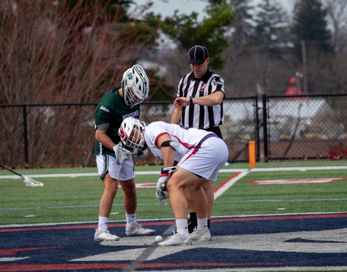
The new approach will still feature the dome-like graphic, but will only associate it with academic, business, and formal advertisements of the school. Where the change is being made regards the athletic and social based graphic, which contains the abbreviation “RMU” with a red banner running underneath it.
“Our official academic mark is still the dome,” he stated. “The only major difference is our business card, which is changing from the dome to the banner. Any official academic letters that I send will continue to be the dome.”
The change in logos will also affect the football turf field in Joe Walton Stadium, which currently has the dome graphic at the 50 yard-line. Changes in the logo have already been made around campus, and continue to be implied in future projects and advertisements.


