Opinion: Ranking Horizon League Jerseys
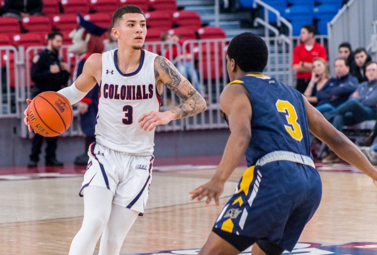
Colby Sherwin ranks the Horizon League jerseys, and the Colonials rank pretty high on his list. Photo Credit: David Auth
November 27, 2020
Note: Opinions are of the writer and not Colonial Sports Network as a whole.
Jerseys are an important part of college basketball and with the Colonials joining the Horizon League, there are new teams to watch and new jerseys to see. So, how do the Colonials stack up against the competition?
For me, when it comes to ranking jerseys, I look for the potential the mascot can have on the jerseys and the color schemes that can be used to make the jerseys. I also look to see how well that they look, if there are any alternate jerseys, and any cool features the jerseys have.
12. Purdue Fort Wayne Mastodons
With an elephant as a mascot, there are so many possibilities to have. Black and gold as a color scheme have yielded some great jerseys in professional sports, and there many routes the Mastodons could have taken but took the wrong one. With only two uniforms that look exactly alike, it was a big disappointment to see. PFW has two jerseys, a white home uniform, and a black away uniform, both with the school’s logo on it. It was a very boring uniform that I wasn’t expecting. The Mastodons had so much potential but did not wow me with their jersey scheme. The Mastodons are a new team in the league like RMU and instantly fall into the bottom of the jersey rankings.
11. Cleveland State Vikings
Unlike PFW, Cleveland State does have nice uniforms, but like them, they do not have any alternate jerseys which is a big deterrent for me. The Vikings have similar jerseys to Green Bay, but CSU’s are less exciting. With no alternate jersey, there’s not much that distinguishes CSU from Green Bay. When the teams play each other, it will look like an intrasquad scrimmage. Just like the Cleveland Browns, who share a city with Cleveland State, the teams also share a boring jersey for a boring team with a very good mascot. A Viking could have so much potential and they missed it.
10. Youngstown State Penguins
When I saw that Youngstown State’s mascot was a penguin I was intrigued with the possible jerseys that could be made from it. With so much potential because of their name and no alternates, there’s no way they can be any higher than eight. I was so disappointed to see they had no alternate in their own uniform for white and red. Their home uniform is cool with it spelling out Penguins, but their away uniform is just a red uniform with Youngstown on top and state on the bottom. I am disappointed to see what they created.
9. Green Bay Phoenix
Now I’m at the part of the list where the jerseys are not bad but are either disappointing or just not that special. When it comes to Green Bay University, there’s nothing special. Green Bay is a simple white and green uniform which is a good idea, but they look exactly like Cleveland State. Green Bay’s home uniform and away uniform both have the same logo and are inverse, with the home having an all-white jersey with Green Bay above the numbers, green shoulders, and green stripes. The away jerseys are inverse of that with a green jersey with white letters and white stripes. Not bad, but a black uniform would be really cool with Green Bay and that’s the only knock I can come up with them. Still better than anything the Packers have ever done with alternates at least.
8. Northern Kentucky Norse
Northern Kentucky has a great color scheme with black and yellow. The home and away jerseys are both inverse colors being white and black which I have no problem with. Both having Northern on top and Kentucky under the numbers looks great, but what puts them above Green Bay is the alternate jersey which is a yellow version of that same jersey that looks fantastic. The Norse may be one of the best teams in the conference and looking good, the Norse seem to have a great 20/20 ahead of them.
7. IUPUI Jaguars
With a nickname like the Jaguars there is so much potential for jerseys, and IUPUI hits it. IUPUI has a nice red and maroon type look. And they’re really clean with IUPUI on both and the one thing that sets them apart is their black alternate! I enjoy black jerseys, and the Jaguars have but instead of red stripes on the jersey that has silver and it really does make a difference as IUPUI looks fantastic. Not only does the school have a great nickname and mascot with Jaguars but nice jerseys as well. IUPUI looks really good.
6. Detroit Mercy Titans
Titans are a cool nickname and have cool uniforms to boot. Their home ones are white with cursive Titans on them and I believe that cursive text on jerseys looks great. The one thing that keeps them out of the top four is there is a uniform looking exactly like RMU with it being navy blue and Detroit on top and mercy on the bottom of the numbers. The one thing that does save the Titans is they have a red jersey that has Titans on it though it is not in cursive but flows well with white script.
5. Milwaukee Panthers
Panthers are such a cool mascot which leads to endless possibilities for jerseys, and Milwaukee doesn’t miss the mark at all. Their home uniforms are a white jersey with ‘MILWAUKEE’ written in black on it, their away ones are a black uniform with ‘MILWAUKEE’ written in yellow on it. My favorite jersey of their scheme is their alternates, which is a grey jersey with yellow text. Milwaukee has good colors so they make the top five. What sets them apart is a very nice color combination of black and yellow and then very nice alternates with grey.
4. Oakland Golden Grizzlies
Golden Grizzlies is a great nickname, and with their colors being black and gold, it would be tough for Oakland to miss on their jersey scheme. Their home and away are inverse jerseys, with the home being a white jersey with ‘OAKLAND’ written in black on it, and the away being black with a gold text on it just looks fantastic. Their alternates are even better, which are yellow, almost cream-colored jerseys with black text. With a great nickname and great jerseys, Oakland is looking really good in 2020.
3. Wright State Raiders
Green and yellow is a great color combination, as we’ve seen in the MLB with the Oakland A’s and the NFL with the Green Bay Packers. Wright State is right along with these teams as their home and away uniforms again look the same with being inverse jerseys. They both have ‘WRIGHT’ on top of the numbers, and ‘STATE’ on the bottom of the numbers but what sets them apart is their alternate black jerseys with Raiders written in cursive on them. It looks really cool. Wright State is one of the best teams in the conference with some of the best uniforms they just missed out on the top two only because their alternates are not as good as the other two schools on the list.
2. Robert Morris Colonials
When I first started looking at Horizon League jerseys, I initially thought that Robert Morris would be at the top of the list, and though being two is not bad, Robert Morris will still look great on the court in their first season in the conference. Their home uniforms are simple with a white jersey and ‘COLONIALS’ in navy on it. Their aways are navy blue with ‘ROBERT’ on top of the numbers and ‘MORRIS’ on the bottom of it. One thing that sets Robert Morris apart from the other schools ranked below them is the red alternate jersey. With a red jersey and white numbers and a white RMU on it, they look amazing.
1. UIC Flames
UIC was not initially even in my radar for the top five, but when a deeper dive was looked into their jerseys there was no way I could keep them from the top spot. Their home-away scheme is very nice with a white and blue jersey with ‘UIC’ on both of them. They have a nice red alternate as well with ‘UIC’ on that. What sets them apart, however, is their light blue alternates that they released in 2018. Light blue with a white side with Chicago on the side and then a Chicago skyline on the shorts in navy blue. Hopefully they continue to wear these because they look amazing. They remind me of the Chicago Bulls’ 2019-20 City Edition jerseys. If they are wearing them, get a chance to look at them because they’re the best jerseys in the conference.


