Looking Over iOS 10
September 19, 2016
The new iPhone 7 is taking the world by storm, but what about its software counterpart? The newest Apple operating system, iOS 10, debuted on Sept. 13, 2016. For those of us not lined up outside of the Apple store, this annual system update is the next best thing.
Everything started out as expected with a push notification appearing on the phone with welcome news that the update was available,which was inevitably followed by the deleting of the apps you can live without to make room for iOS 10. Apple has been scaling down the size of their updates drastically ever since iOS 7, which required three gigabytes to fully install. If you had eight gigabytes of storage on your phone, that was equivalent to 38 percent of your device’s storage. Surprisingly, iOS 10 was a manageable 1.2 gigabytes, which, honestly, isn’t hard to free up.
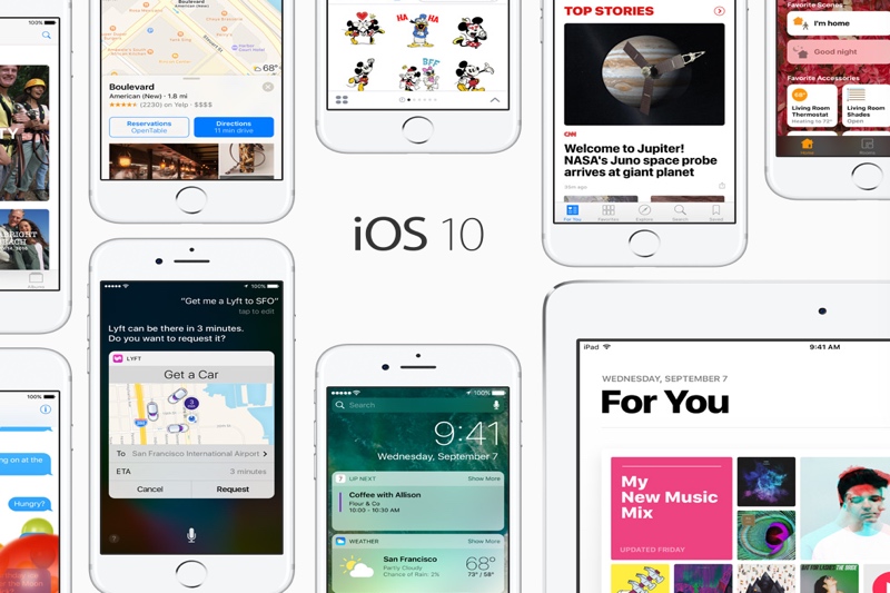
As an iPhone user, this update didn’t bring anything astoundingly new to the table for me. The lock screen, however, did get a whole new feel to it. One of the first things that was leaked about the new system was the removal of the swipe to unlock feature, which has been around ever since 2007. Now, to unlock your phone, you press the home button and then use Touch ID or your password. Users have been complaining that Touch ID was so quick to respond on iOS 9 that you blew right by any notifications. The lock screen overhaul hopes to help eliminate that problem.
Notifications have also seen a slight redesign. They now have their own clean, translucent bubbles on your lock screen and pull down menu. For those of us who compulsively dismiss our notifications, that little ‘x’ at the top now gives you the option of clearing all of your notifications at once.
A lot of the new features and options rely on 3D Touch, which works by varying pressure on your screen when you press. If you haven’t experienced it, Apple introduced 3D Touch on the iPhone 6s. For those of you with an iPhone 6 or earlier, I mourn for you not being able to fully enjoy the convenience 3D Touch has made possible.
A smaller feature that streamlines the usability of the iPhone is the new “Raise to Wake” feature, which can be toggled from the device’s settings. Lift your phone and the screen comes on; place it down and the screen automatically turns off to conserve that precious battery life. Yes, Android has had this feature around for a while, but it’s still a welcome addition to the iPhone.
Speaking of the battery; you would assume that Apple would fix battery drain problems with this update, right? Not exactly. After installing the update, my iPhone gets rather hot when using it and charging. Not something I find very desireable.
In the give and take which is iOS 10, you can now remove that factory clutter from your home screen. I am talking about all of those pre-installed apps that you just shoved in a folder elsewhere and never looked at again. Apple has finally made it possible to delete these apps. The apps that are pre-installed and that you do use–Music, News and Photos–have a brand new look and feel.
For Photos, Apple has worked extensively to catch up to Facebook with facial recognition. They also took a step ahead by adding a map to a picture’s existing location stamp. If music is more of your thing, they have redesigned the Songs category yet again. Reverting back to an earlier way of approaching the problem, your songs are now organized alphabetically by artist instead of by song title. This has me taken aback as to why they had to change a perfectly good thing. I guess you can’t have your cake and eat it, too, and that is what iOS 10 feels like in some ways.
All in all, there is a lot that Apple still needs to improve on and bugs that need to be squashed before this version of iOS can be as polished as they would like it. Hopefully, with time and more updates, Apple can finally start to compare with Android and Samsung again. On the bright side at least the iPhone 7 hasn’t been known to burst into flames like its rival, the Note 7.


